Branding a playful river front café
sandbar
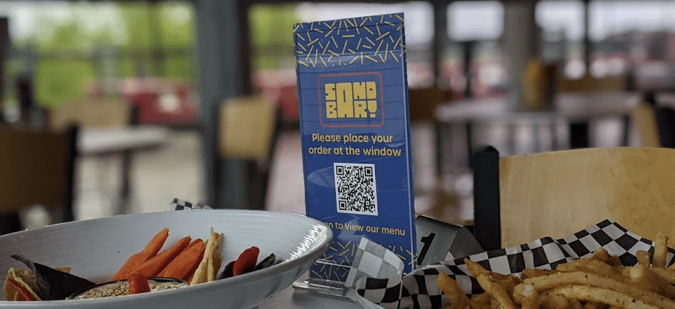
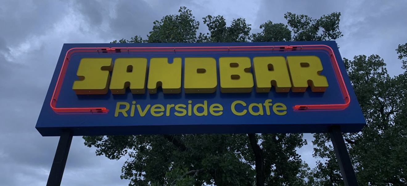
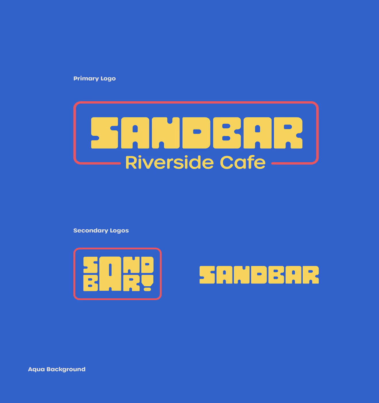
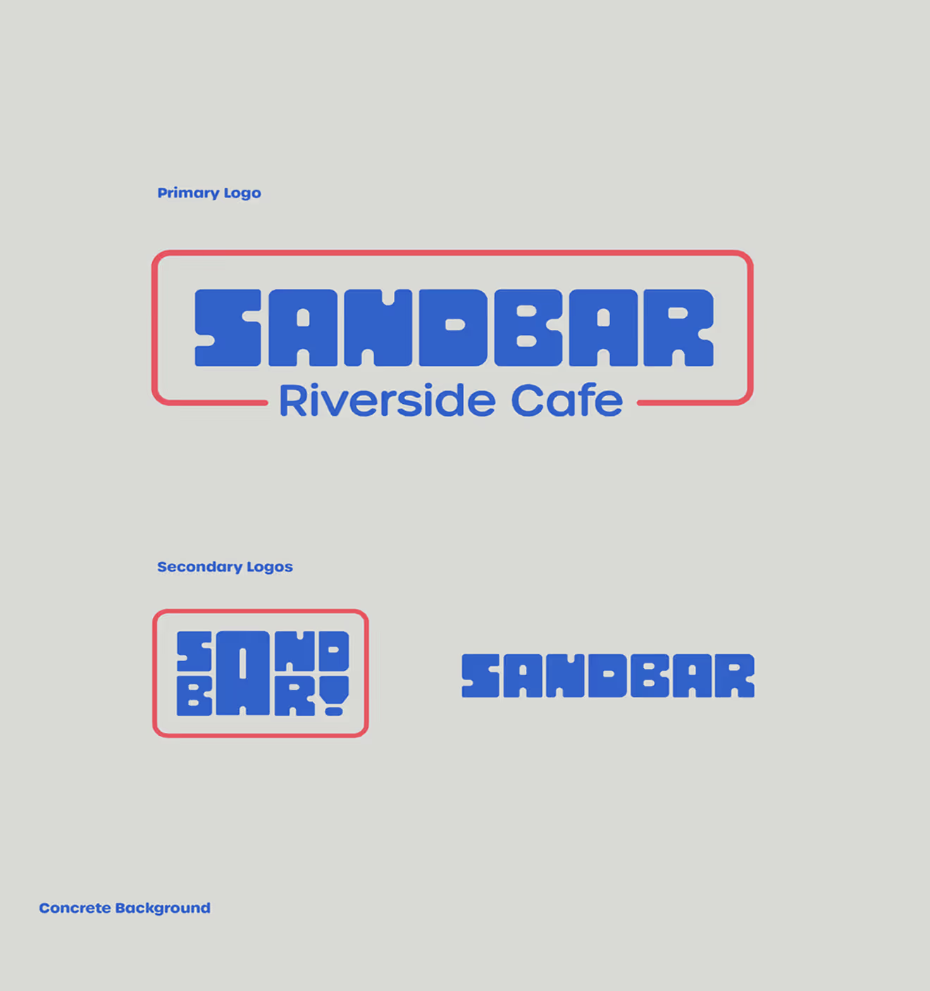
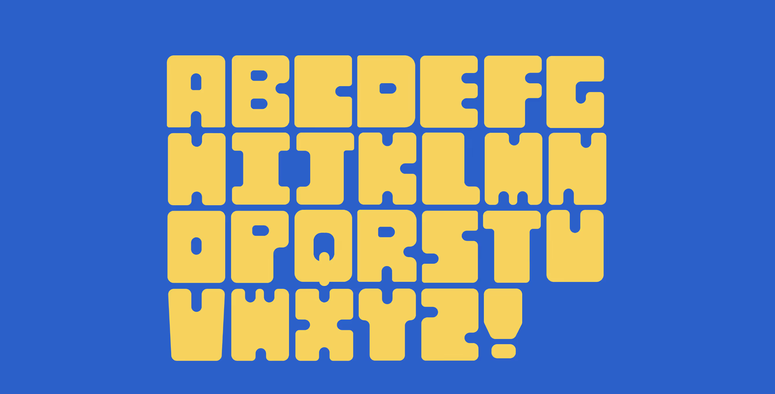
A riverfront dining destination, Sandbar wanted a visual identity that was playful, accessible, and welcoming. I created a brand that played up Sandbar’s biggest differentiator — its outside space and experience — and focused on making Tulsans comfortable, relaxed, and refreshed.
TL;DR
Project Type
Restaurant Branding and Identity Design
Deliverables
Logo and Branding
My Contribution
Concepting, Identity Design, Final Handoff
Sketches
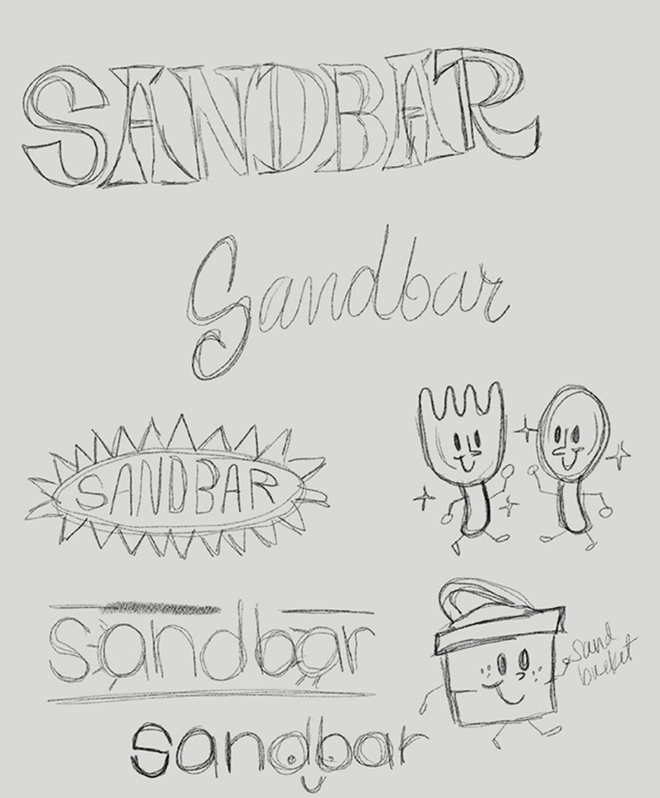
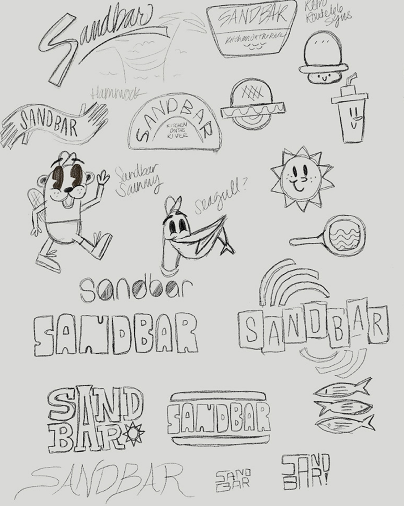
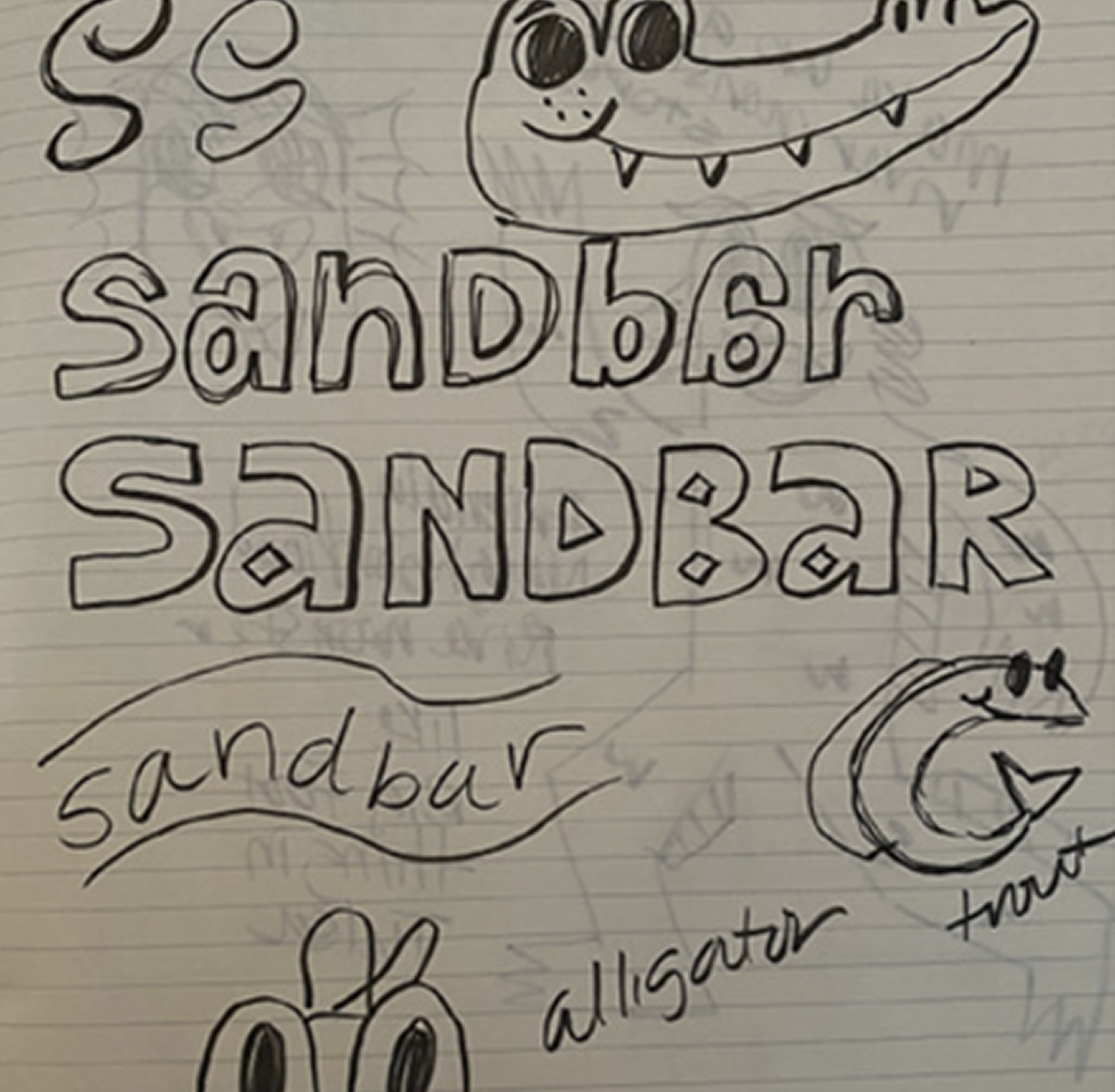
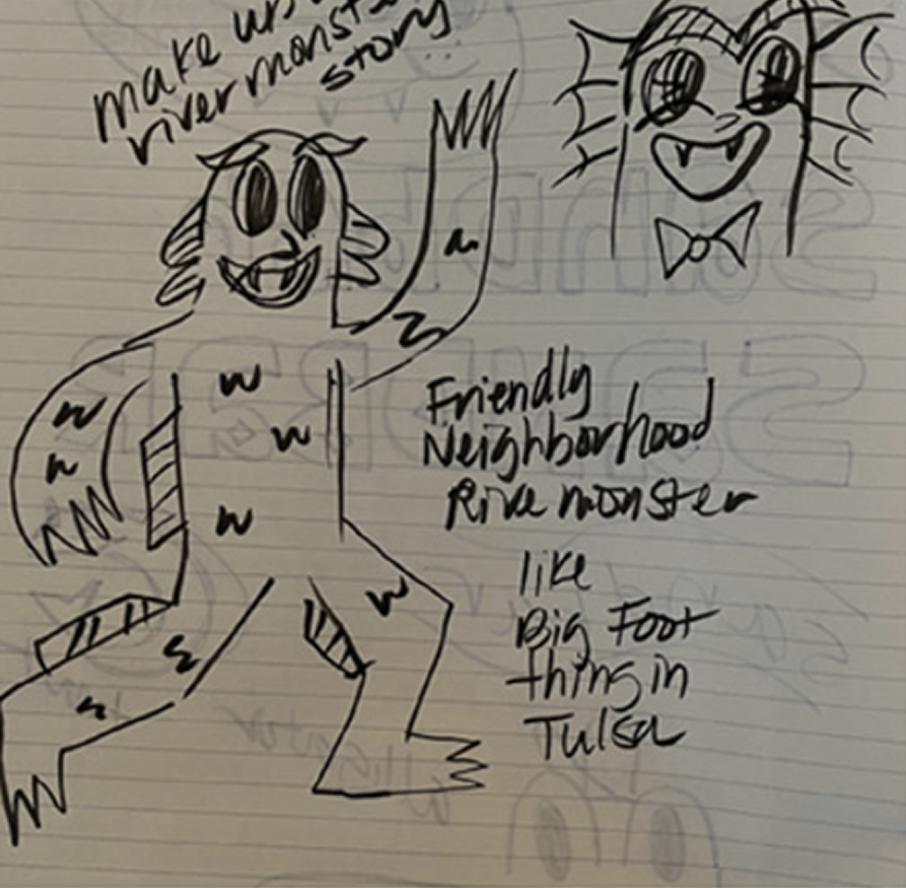
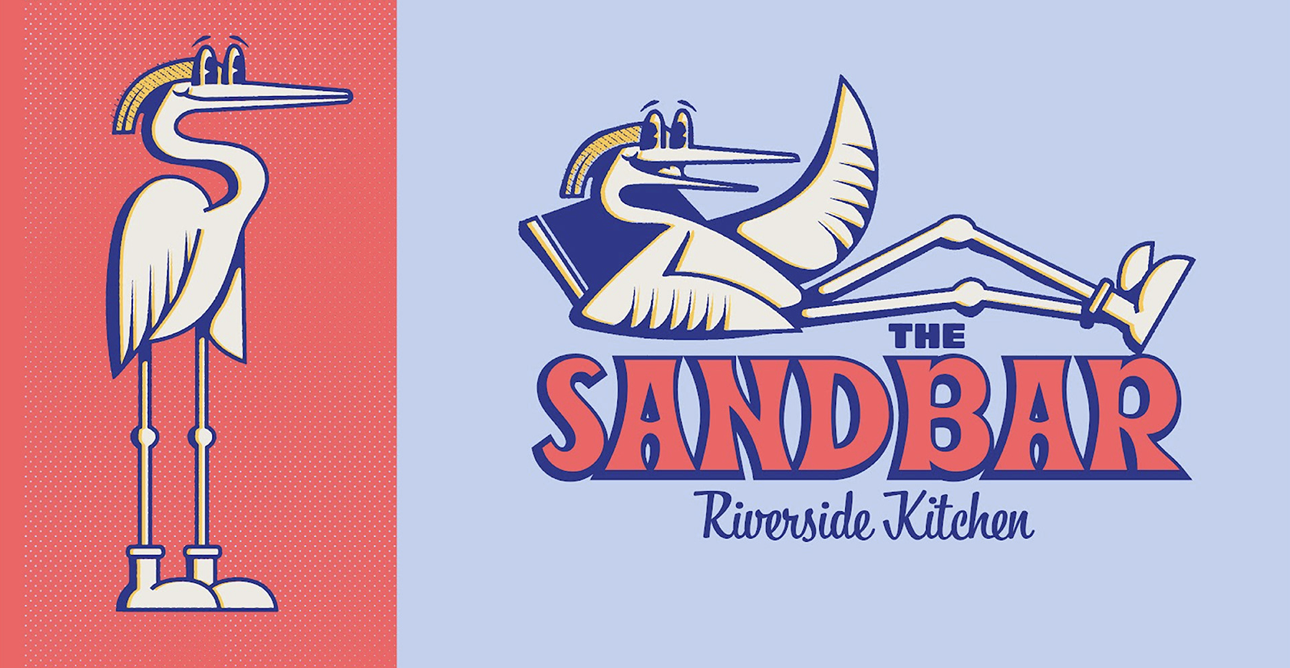
In the sketch phase, I explored a few character directions as well as some custom type directions. This was very inspired by retro character branding and 50's style type design. Keeping in mind that our persona was families with children, I wanted this to feel very friendly and welcoming, but also memorable compared to the restaurants in the area.
Initial Concepting
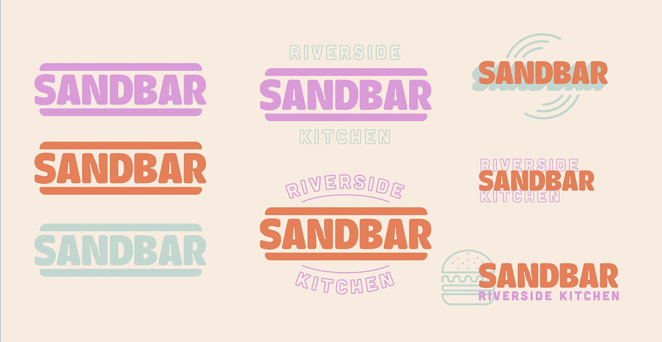
Explored both directions of a custom character and/or a custom logotype. Kept the colors bright, yet retro-inspired to bring an approachable aesthetic to the branding. Since the main item Sandbar would serve was burgers, wanted to incorporate that in the branding in some way. Also played around with the Heron as a mascot direction since they're found along the river.

Final Direction
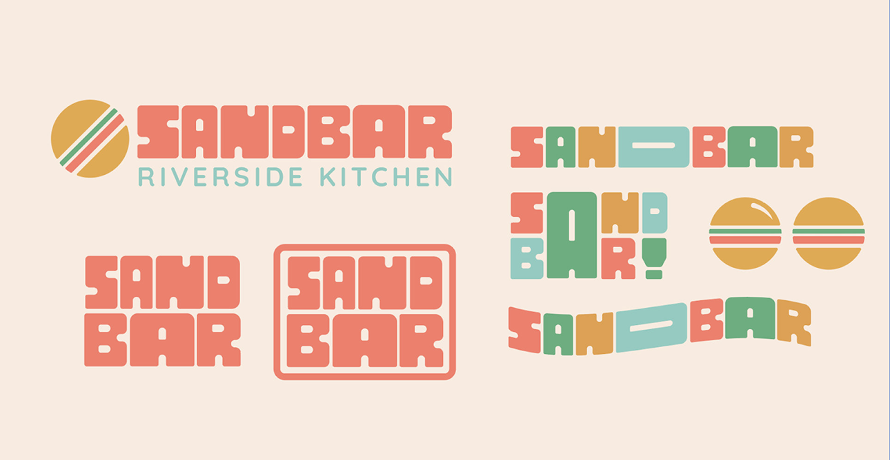
Ultimately, a few concepts were combined to create the final direction. The deep green, black, cream and gold colors compliment the interior design in the space. The client wanted to use a bright neon pink sign in the seating area, so this color palette allowed that to stand out and not compete. The icon mark represents the Basque Region of Spain, which the restaurant is inspired by. The symbol combines an overhead view of a pot, cod fish, and a fork to create a unique mark for the restaurant.
