helping a local chef brand a new restaurant concept
restaurant basque
Amelia Easley, the owner of Amelia's in Tulsa's Arts District, approached Gitwit with the task of branding her new restaurant concept she was opening next door called 'Restaurant Basque.' The cuisine would be seafood forward, heavily inspired by her love of the Basque Region in Spain. The restaurant would also have a market concept attached.
The brand needed to be elevated enough to stand alongside Amelia's current branding, but feel different enough that it wasn't mistaken for the same restaurant.
TL;DR
Project Type
Restaurant Branding and Identity Design
Deliverables
Logo and Branding
My Contribution
Concepting, Identity Design, Final Handoff


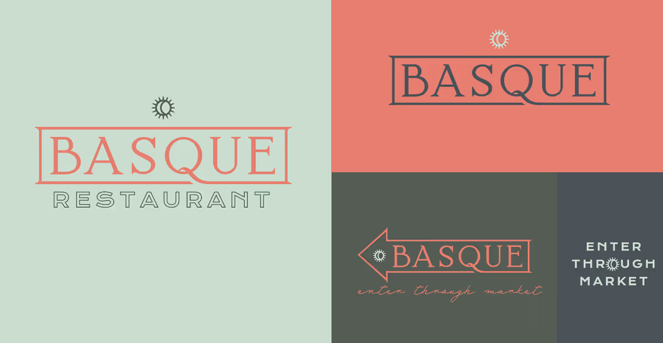
Sketches
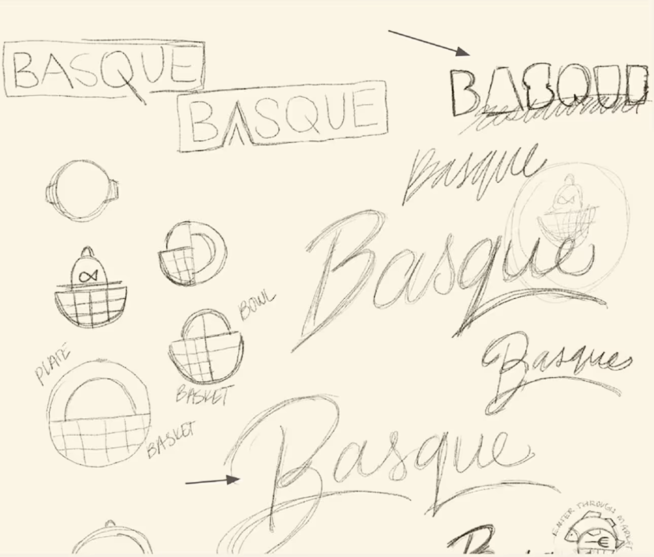
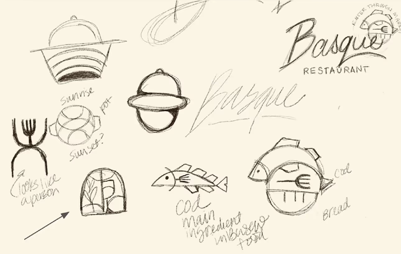
In the sketch phase, I explored some custom script lettering and some sort of mark that could represent the Basque countryside or the food that would be served. During my research, I found that the cod is a major component to traditional Basque Cuisine, so I started to incorporate that into sketching as well.
Initial Concepting
In the sketch phase, I explored some custom script lettering and some sort of mark that could represent the Basque countryside or the food that would be served. During my research, I found that the cod is a major component to traditional Basque Cuisine, so I started to incorporate that into sketching as well. Along with the seafood idea, I tried incorporating a subtle hook into a concept.
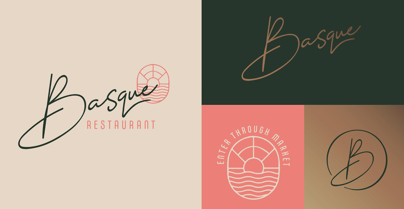

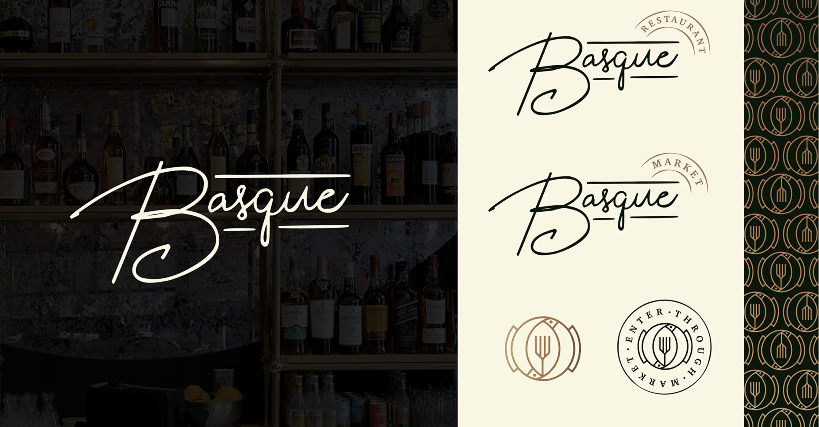
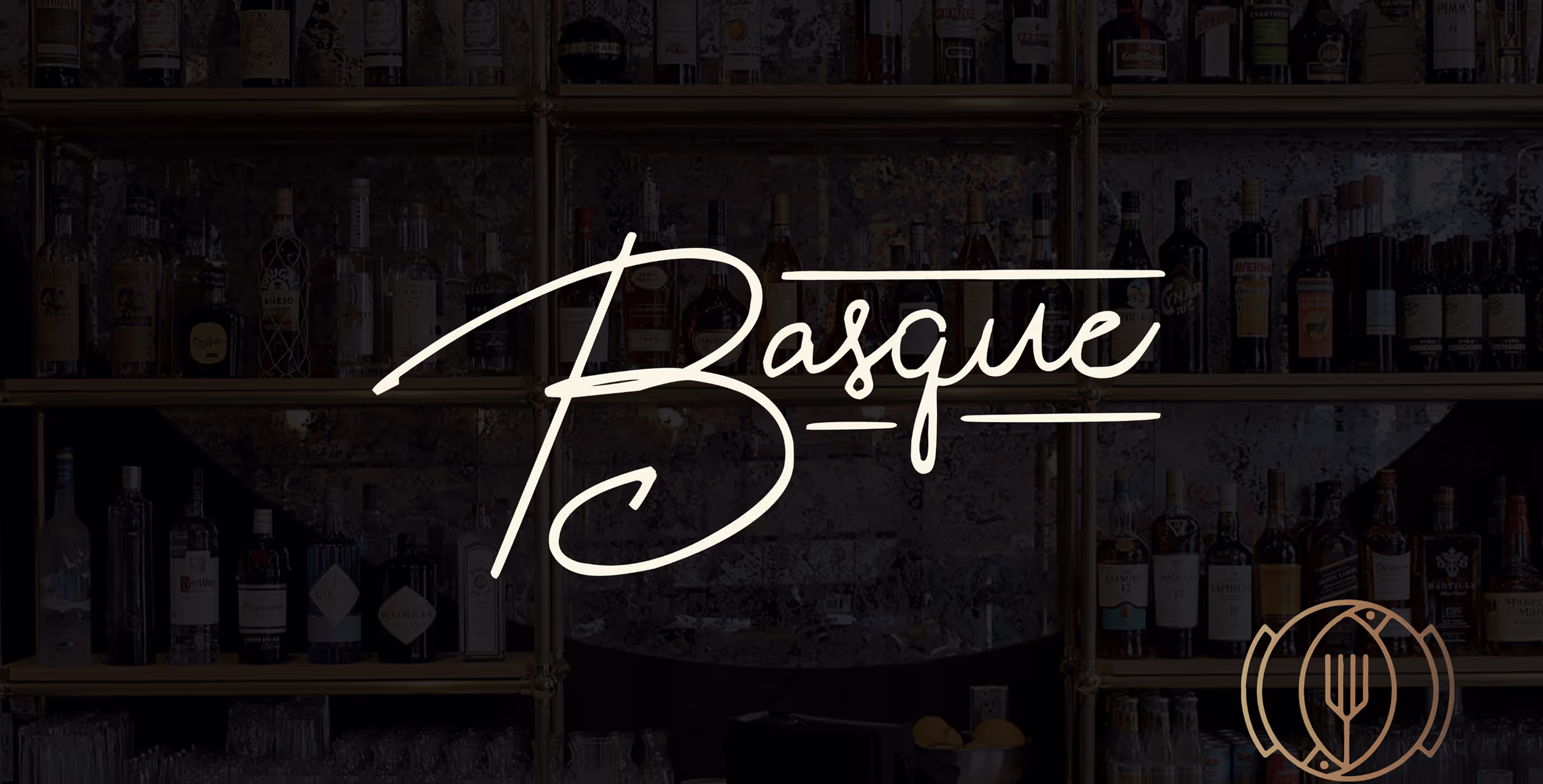
Final Direction
Ultimately, a few concepts were combined to create the final direction. The deep green, black, cream and gold colors compliment the interior design in the space. The client wanted to use a bright neon pink sign in the seating area, so this color palette allowed that to stand out and not compete. The icon mark represents the Basque Region of Spain, which the restaurant is inspired by. The symbol combines an overhead view of a pot, cod fish, and a fork to create a unique mark for the restaurant.